Digital Menus for Restaurants: Layout, Pricing and Readability
How to design digital menus for restaurants that customers read in seconds: layout, categories, price placement, typography, contrast and updates.
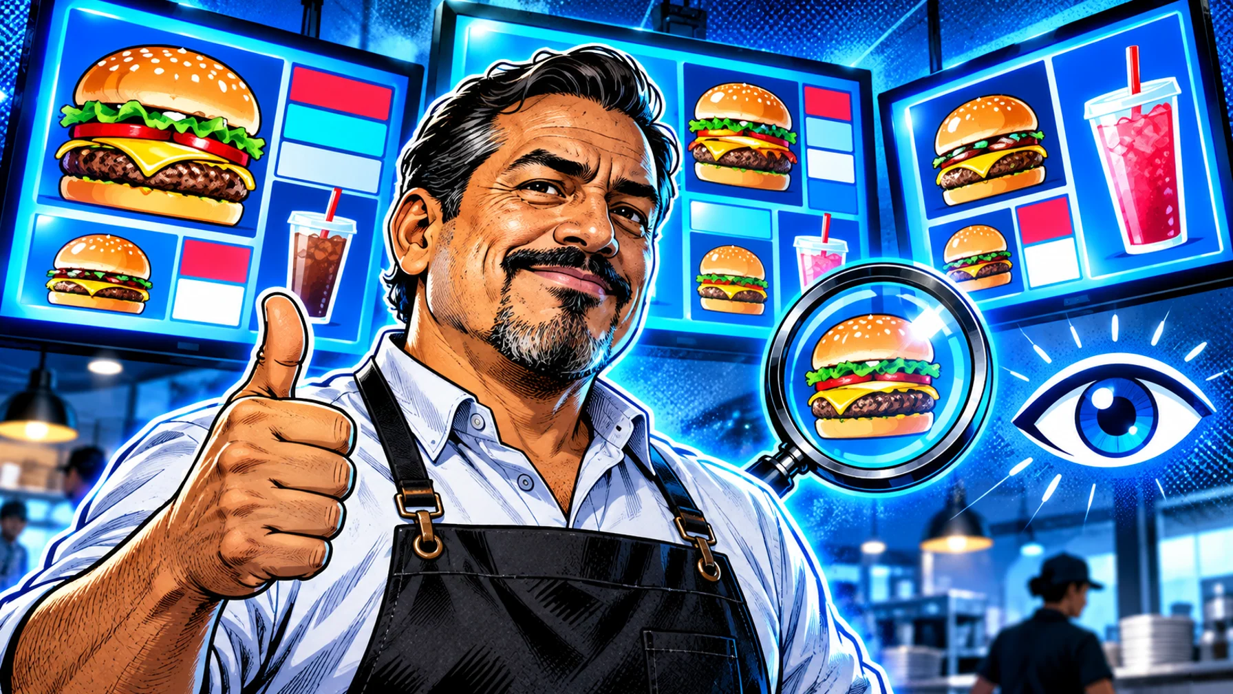
Digital menus for restaurants work when customers can find what they want and see the price in a few seconds, from the back of the queue. That comes down to three things: a layout with clear categories and a predictable reading order, prices that are easy to spot and simple to compare, and readability at real viewing distances, with large type, strong contrast and little clutter. This guide covers each one with practical rules you can apply to any screen, whether you run one café menu or digital menu boards across many restaurants.
Start with how people read a menu board
People rarely read a menu board from top to bottom. They scan for the category they want, look at a few options, check prices and decide, often while talking to someone or moving in a queue. A good digital menu supports that scanning.
Customers look for categories first. Clear category headings (breakfast, burgers, bowls, drinks) let people jump to the part they care about.
They compare a small number of options. Showing six burgers is easier to choose from than showing fifteen.
They decide quickly. Every extra word, decoration or animation competes for those few seconds.
Design every screen for that short, distracted read, not for someone studying a printed menu at the table. For the bigger picture of planning screens, hardware and schedules, see our complete guide to digital menu boards.
Layout: structure the menu before you design it
Organise by category and keep the order fixed
Group items into a handful of categories and keep them in the same position on every screen and at every location. Regular customers learn where things are, and new customers find them faster. If you run a row of screens, give each screen a clear role, for example mains on the first, sides and combos on the second, drinks and desserts on the third.
Give each screen one job
A screen that tries to show the full menu, a promotion, a video and opening hours at once is hard to read. Let one screen carry the promotion or the hero product and keep the others for the core menu.
Use a grid and white space
Align item names and prices on a consistent grid so the eye can move down a column. Leave space between categories. Empty space is what makes a dense menu feel easy.
Put the most important items where eyes land
Customers tend to look at the centre of a screen and at the top of each category first. Place best sellers and higher-margin items in those positions, and use a single hero image to draw attention to one of them.
Pricing: make prices easy to find and to trust
Keep prices next to item names
Prices should sit directly beside or below the item they belong to, aligned in a column so people can compare them at a glance. Avoid long dotted leaders across the screen; at a distance they make it harder to match price and item.
Make combos and add-ons obvious
Show combo prices next to the combo, and present add-ons near the items they go with: a side next to the burger, a pastry next to the coffee. This is also where digital menus help upselling, because you can rotate suggestions by daypart.
Keep prices as editable text
If a screen uses images or video, keep prices as separate text in the template rather than baking them into a picture. Then a price change is a quick edit instead of a new design, and every location stays correct.
Handle local prices with one template
If prices differ by location, do not create a separate menu for each store. Use one template and set location-specific prices. Pilosign groups screens by location and lets you update one store, a group or every screen from the same dashboard.
Readability: design for distance, light and speed
Size type for the back of the queue
Item names and prices must be readable from the furthest point where customers decide, which is often several metres away. Test it in the restaurant: stand at the back of the queue and check whether you can read the smallest price without effort. If not, the text is too small or there is too much of it.
Use strong contrast
Light text on a dark background or dark text on a light background is easiest to read on screens. Avoid placing text on top of busy food photography, and check the board under the restaurant's real lighting, including daylight from windows.
Limit fonts and styles
Use one or two typefaces from your brand, with bold for item names and regular for descriptions. Avoid script fonts and long blocks of capital letters, which slow reading.
Keep descriptions short
A short line that helps a customer choose ("grilled chicken, chipotle mayo") is enough. Ingredients lists and stories belong on the website or the ordering app.
Use motion with restraint
Motion attracts the eye, so use it on one area at a time and keep loops short. A whole menu that animates is harder to read than a static one. For ideas on short menu videos, see AI menu video templates.
Photos and visuals
Good food photography sells, but on a menu board it has to work at a distance and next to text.
Use fewer, larger photos. One strong image per screen or per category beats many small thumbnails.
Keep a consistent style. Same lighting, angle and background across items, so the menu looks like one system.
Show the actual product. The photo should look like what the customer receives.
Leave room for text. Crop images so names and prices never sit on top of the busiest part of the picture.
Keeping digital menus accurate
The main advantage of a digital menu is that it can always be correct. That only happens if updates are quick and someone owns them.
Schedule dayparts
Breakfast, lunch, dinner and late-night menus should switch on their own. Pilosign schedules content by time of day, day of week and location, so the right menu appears without anyone touching the screen.
Plan promotions with end dates
Every promotion should have a start date and an end date, so expired offers disappear automatically.
Update sold-out items and allergens
Make it easy for store teams to hide an item that sold out and to keep dietary labels current. Clear permissions help: head office controls the brand and core menu, while store managers can make local changes.
Check what each screen is showing
A dashboard that shows which screens are online and what they are playing helps you catch problems before customers do. For more on choosing tools with these features, read digital menu board software: features to compare.
Test the menu in the restaurant
A layout that looks right on a laptop can fail on the wall. Before you roll a design out, test it where customers will see it.
Stand where customers decide. Read the board from the back of the queue and from the side, not just from directly in front of the counter.
Check different times of day. Daylight from windows in the morning and warm lighting at night change how readable a screen is.
Time a first-time reader. Ask someone who does not know the menu to find a specific item and its price. If it takes more than a few seconds, simplify the layout.
Ask the team. Staff hear the questions customers ask at the counter. Repeated questions often point to something the menu does not make clear.
A quick checklist before you publish
Categories: clear, few, in a fixed order on every screen. Prices: next to items, aligned, as editable text. Type: readable from the back of the queue. Contrast: strong, tested under real light. Photos: few, large, consistent. Motion: one area at a time. Schedules: dayparts and promotion end dates set. Owner: one person responsible for updates.
FAQ
What makes a digital menu easy to read? A small number of clear categories, large item names and prices, strong contrast and very little extra text or animation.
How many items should one menu screen show? As few as you can while still covering the category. If a screen feels crowded from the back of the queue, split it or rotate secondary items.
Should prices be part of the menu images? No. Keep prices as editable text in the template so changes are quick and consistent across locations.
Can different restaurants show different prices? Yes. Use one template and set location-specific prices for each group of screens.
What hardware do digital menus need? A display, a media player or supported smart TV, and a stable connection. See the digital signage player page for supported devices.
Put your menu on screen
A readable digital menu is mostly good structure and discipline, and the software should make keeping it current effortless. See how digital menu boards work in Pilosign, explore more restaurant digital signage ideas, or start free with your first screen.